ROLE
ROLE
Branding, Motion Design, Illustration
Branding, Motion Design, Illustration
TEAM
TEAM
Param Shah - Branding
Navaneeth Venu - Website
Jeremy, Gopi - 3D
Sneha Suri - Illustration
Param Shah - Branding
Navaneeth Venu - Website
Jeremy, Gopi - 3D
Sneha Suri - Illustration
DURATION & STATUS
DURATION & STATUS
1.5 Months, Live
1.5 Months, Live
EMPLOYER
EMPLOYER
Spacekayak
Spacekayak
CONTENTS
CONTENTS
Branding
Branding
Showcase Video
Final Scenes
ROLE
Branding, Motion Design, Illustration
TEAM
Param Shah - Branding
Navaneeth Venu - Website
Jeremy, Gopi - 3D
Sneha Suri - Illustration
DURATION & STATUS
1.5 Months, Live
EMPLOYER
Spacekayak
Reimagining a new face of accessible global compute with GPU.NET
Reimagining a new face of accessible global compute with GPU.NET
Reimagining a new face of accessible global compute with GPU.NET
Reimagining a new face of accessible global compute with GPU.NET
Overview
Overview
Designing a modern brand identity for a cloud-computing provider to emphasize accessibility and global reach.
Designing a modern brand identity for a cloud-computing provider to emphasize accessibility and global reach.
Designing a modern brand identity for a cloud-computing provider to emphasize accessibility and global reach.
My Role
My Role
As an intern at Spacekayak, I got the opportunity to work on the GPU.NET rebranding project. I was responsible for overseeing the complete transformation of their brand identity.
My role spanned from the early stages of brand discovery to the final production of visual assets, which included the logo, brand elements, illustrations, motion design and the brand video.
Understanding
Understanding
the brand, the mission & the market
the brand, the mission & the market
1.1 Brand Workshop
1.1 Brand Workshop
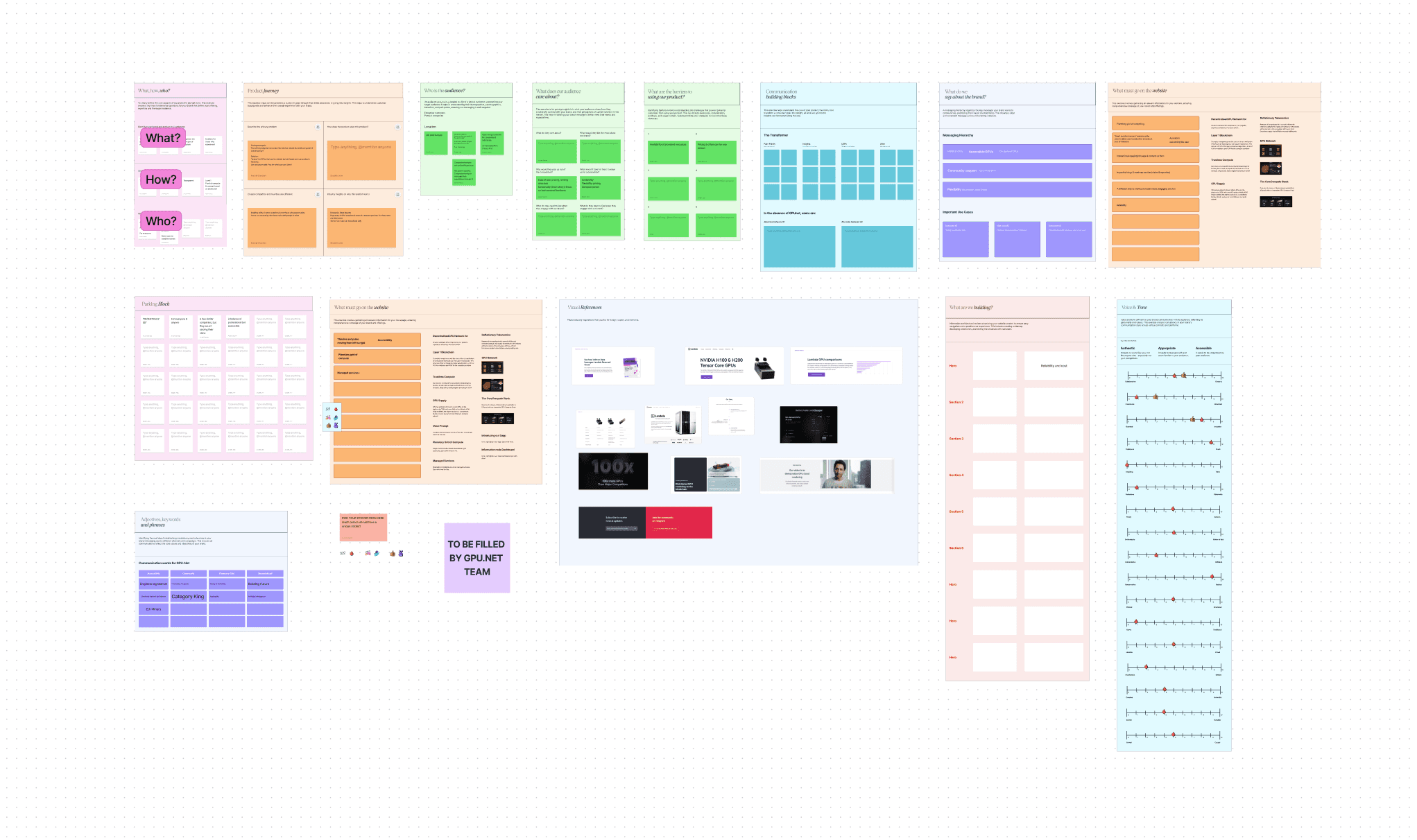
This stage involved a collaborative workshop conducted by one of the main members at Spacekayak. As a spectator, I had the opportunity to observe key discussions around GPU.NET’s goals, mission, and target market.
The workshop served to uncover insights into how the company wanted to position itself, specifically in terms of its accessibility-driven ethos in the GPU computing world.
Although I didn’t lead this phase, I gained a deep understanding of the foundational ideas that would inform the rest of the project.


1.2 Why Rebrand?
1.2 Why Rebrand?
GPU.NET sought a rebrand from Spacekayak in preparation for the launch of their newly updated app and decentralized global compute network. Their existing branding was outdated and didn’t reflect their evolving vision or position in the market.
GPU.NET sought a rebrand from Spacekayak in preparation for the launch of their newly updated app and decentralized global compute network. Their existing branding was outdated and didn’t reflect their evolving vision or position in the market.
Modernizing Their Identity
Modernizing Their Identity
GPU.NET wanted a refreshed visual identity to stand out in a highly competitive landscape. Their former branding no longer resonated with the company’s innovative offerings or future-forward goals.
GPU.NET wanted a refreshed visual identity to stand out in a highly competitive landscape. Their former branding no longer resonated with the company’s innovative offerings or future-forward goals.
Reflecting New Values
Reflecting New Values
The rebrand needed to highlight their commitment to providing accessible global compute for all, ensuring their visual identity aligned with their mission to democratize GPU computing power for a worldwide audience.
1.3 Deliverables
1.3 Deliverables
The main requirements from GPU.NET's team were the following:
The main requirements from GPU.NET's team were the following:
Rebranding
Promo Video
Website (not involved)
Rebranding
Promo Video
Website (not involved)
1.4 Competitor Analysis
1.4 Competitor Analysis
My role became more hands-on during the competitor analysis. I researched direct competitors in the GPU and cloud computing sectors, dissecting their branding strategies, visual identities, and messaging.
This research provided a clear picture of where GPU.NET could stand out and emphasized the need for a distinct, authoritative yet approachable identity. This phase directly influenced the later design decisions, ensuring that GPU.NET’s brand was not only competitive but memorable.
Defining
Defining
the brand archetype, verbal & visual identity
the brand archetype, verbal & visual identity
—We first focused on synthesizing the information from the brand workshop to create the verbal identity for GPU.NET
—We first focused on synthesizing the information from the brand workshop to create the verbal identity for GPU.NET
—We first focused on synthesizing the information from the brand workshop to create the verbal identity for GPU.NET
2.1 Brand Archetype
2.1 Brand Archetype
The Ruler
We opted for the ruler archetype which symbolized their ambition to establish leadership and authority in the GPU computing community, aligning perfectly with their mission to make high-end GPU processing accessible to a global audience.
We opted for the ruler archetype which symbolized their ambition to establish leadership and authority in the GPU computing community, aligning perfectly with their mission to make high-end GPU processing accessible to a global audience.
We opted for the ruler archetype which symbolized their ambition to establish leadership and authority in the GPU computing community, aligning perfectly with their mission to make high-end GPU processing accessible to a global audience.
2.2 Brand Voice
2.2 Brand Voice
Every brand has its own voice and way of communicating with its consumers. For GPU.NET, we opted for the following qualities based on its chosen archetype.
Every brand has its own voice and way of communicating with its consumers. For GPU.NET, we opted for the following qualities based on its chosen archetype.
Every brand has its own voice and way of communicating with its consumers. For GPU.NET, we opted for the following qualities based on its chosen archetype.
Authoritative
Authoritative
GPUNet speaks with certainty and expertise, using their tech savviness and assured language to establish credibility and lead the conversation.
GPUNet speaks with certainty and expertise, using their tech savviness and assured language to establish credibility and lead the conversation.
Charismatic
Charismatic
GPUNet captivates its audience with a vibrant charm, weaving engaging narratives that resonate emotionally and personally.
GPUNet captivates its audience with a vibrant charm, weaving engaging narratives that resonate emotionally and personally.
Empowering
Empowering
GPUNet inspires its community to take action, highlighting their strengths and possibilities with a supportive and encouraging voice.
GPUNet inspires its community to take action, highlighting their strengths and possibilities with a supportive and encouraging voice.
Fresh
Fresh
GPUNet brings a burst of freshness to every interaction, adopting new, innovative use cases & perspectives to communicate that resonate with the audience.
GPUNet brings a burst of freshness to every interaction, adopting new, innovative use cases & perspectives to communicate that resonate with the audience.
2.3 Brand Positioning
2.3 Brand Positioning
To set GPU.NET apart from its competitors we worked on creating a distinct perception by positioning it as the AirBnb of GPUs, a brand that is accessible, trustless, flexible and community-centric.
To set GPU.NET apart from its competitors we worked on creating a distinct perception by positioning it as the AirBnb of GPUs, a brand that is accessible, trustless, flexible and community-centric.
Based on this we created the building blocks of communication for GPU.NET -
Based on this we created the building blocks of communication for GPU.NET -
On demand
On demand
On demand
On demand
Inferencing models
Inferencing models
Inferencing models
Inferencing models
Planetary grid of computing
Planetary grid of computing
Planetary grid of computing
Planetary grid of computing
Transparent
Transparent
Transparent
Transparent
Breaking the monopoly over computing
Breaking the monopoly over computing
Breaking the monopoly over computing
Breaking the monopoly over computing
Decentralized GPU network
Decentralized GPU network
Decentralized GPU network
Decentralized GPU network
Level 1 Blockchain
Level 1 Blockchain
Level 1 Blockchain
Level 1 Blockchain
Accessible, available and for everyone
Accessible, available and for everyone
Accessible for everyone
Accessible, available for everyone
Training models
Training models
Training models
Training models
Finetuning models
Finetuning models
Finetuning models
Finetuning models
Trustless
Trustless
Trustless
Trustless
2.4 Brand Summary
2.4 Brand Summary
Summarizing GPU.NET's brand
Summarizing GPU.NET's brand
Empowering everyone who wants to experiment by making compute accessible — the Airbnb of GPUs.
Empowering everyone who wants to experiment by making compute accessible —
the Airbnb of GPUs.
Thus, the essence of GPU.NET's new brand is in making compute accessible for everyone with their primary personality traits being leadership and tech savviness. Its personality is one that takes charge and leads others forward and is charismatic, fresh and original.
Thus, the essence of GPU.NET's new brand is in making compute accessible for everyone with their primary personality traits being leadership and tech savviness. Its personality is one that takes charge and leads others forward and is charismatic, fresh and original.
Thus, the essence of GPU.NET's new brand is in making compute accessible for everyone with their primary personality traits being leadership and tech savviness. Its personality is one that takes charge and leads others forward and is charismatic, fresh and original.
—The next step was to define the style for the visual identity, that is, the logo, type, layouts, colors and elements etc.
—The next step was to define the style for the visual identity, that is, the logo, type, layouts, colors and elements etc.
—The next step was to define the style for the visual identity, that is, the logo, type, layouts, colors and elements etc.
2.5 Moodboard
2.5 Moodboard
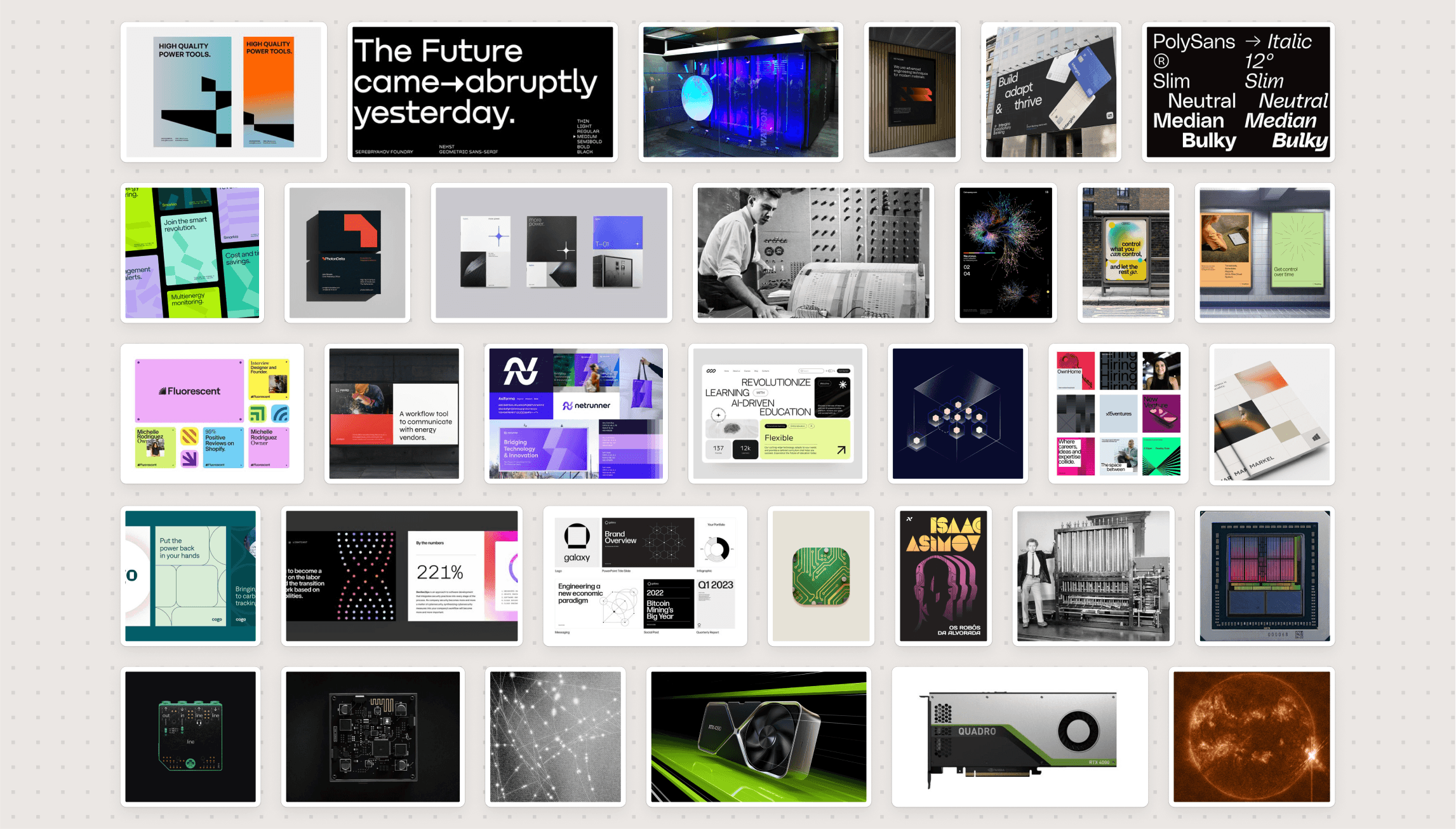
A moodboard to was created and presented to the client based on their input given in the brand workshop. It includes different kinds of visual references.
A moodboard to was created and presented to the client based on their input given in the brand workshop. It includes different kinds of visual references.
A moodboard to was created and presented to the client based on their input given in the brand workshop. It includes different kinds of visual references.


2.6 Stylescapes
2.6 Stylescapes
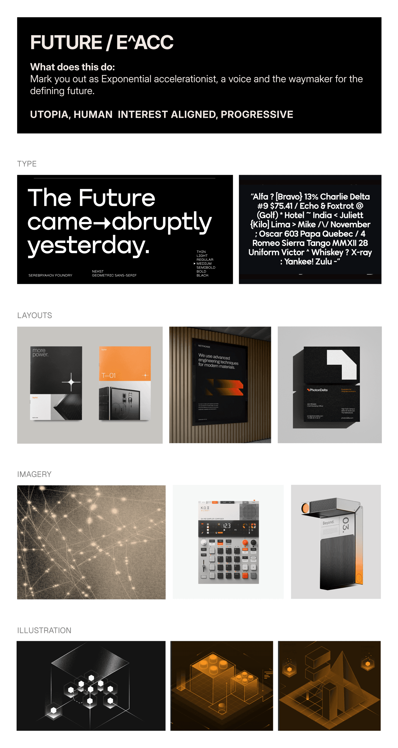
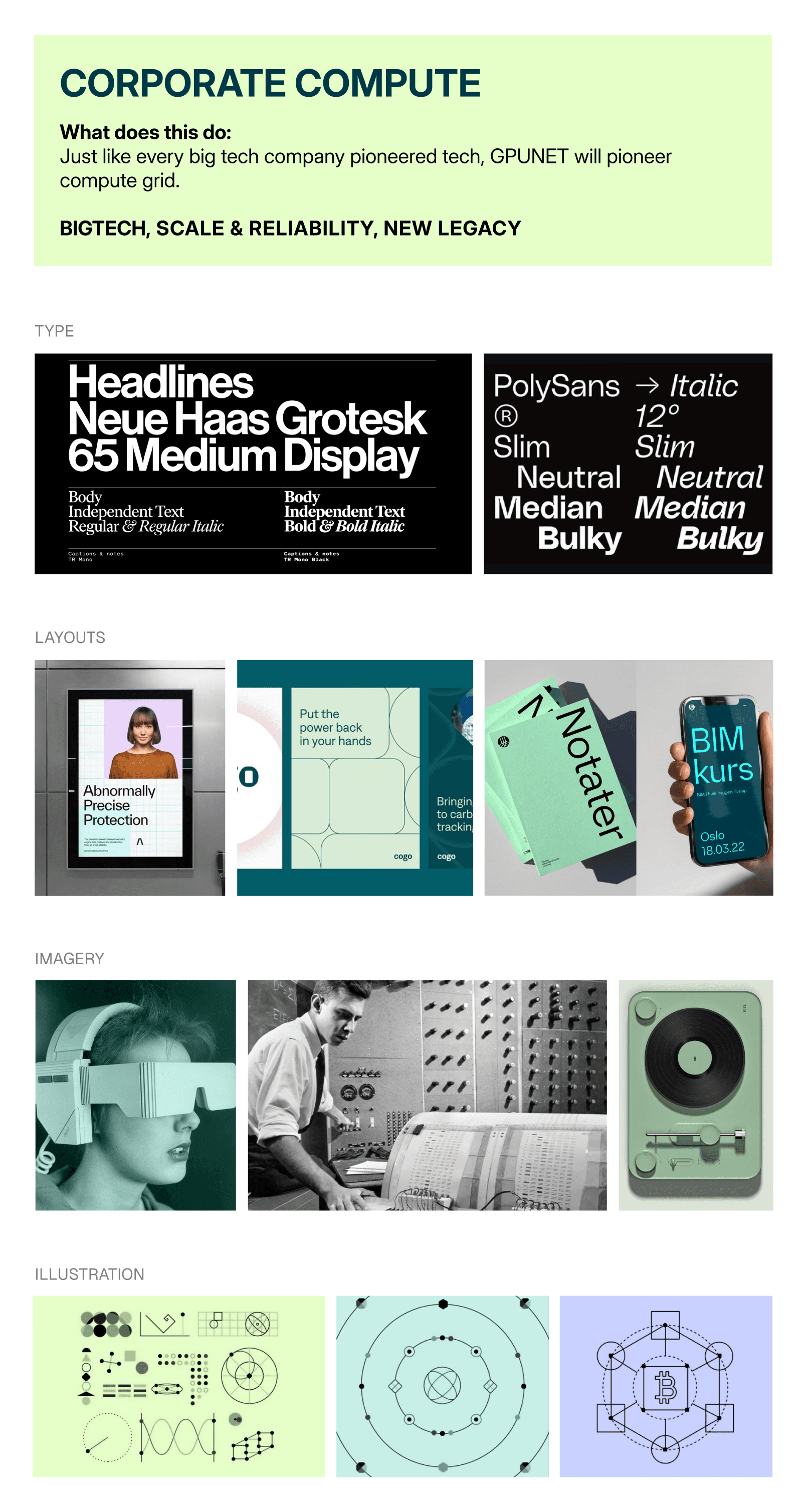
Based on client feedback on the moodboard, two stylescapes demonstrating distinct visual narratives and references for different visual elements were made. The final stylescape selected served as the main reference for the visual elements later on.
Based on client feedback on the moodboard, two stylescapes demonstrating distinct visual narratives and references for different visual elements were made. The final stylescape selected served as the main reference for the visual elements later on.
Based on client feedback on the moodboard, two stylescapes demonstrating distinct visual narratives and references for different visual elements were made. The final stylescape selected served as the main reference for the visual elements later on.
Selected Stylescape
Selected Stylescape
Selected Stylescape




Designing
Designing
the logo, the assets & the motion
the logo, the assets & the motion
the logo, the assets & the motion
-the next step was to craft the final visual identity, starting off with the logo
-the next step was to craft the final visual identity, starting off with the logo
-the next step was to craft the final visual identity, starting off with the logo
3.1 Logo
3.1 Logo
Based on the synthesis and visual directions, I began exploring logo concepts and narrative themes.
This stage was iterative and involved multiple rounds of sketching, refining, and testing logo ideas after which, 3 different directions for the logo and the narrative were chosen.
Based on the synthesis and visual directions, I began exploring logo concepts and narrative themes.
This stage was iterative and involved multiple rounds of sketching, refining, and testing logo ideas after which, 3 different directions for the logo and the narrative were chosen.
The Core of Computing
The Core of Computing
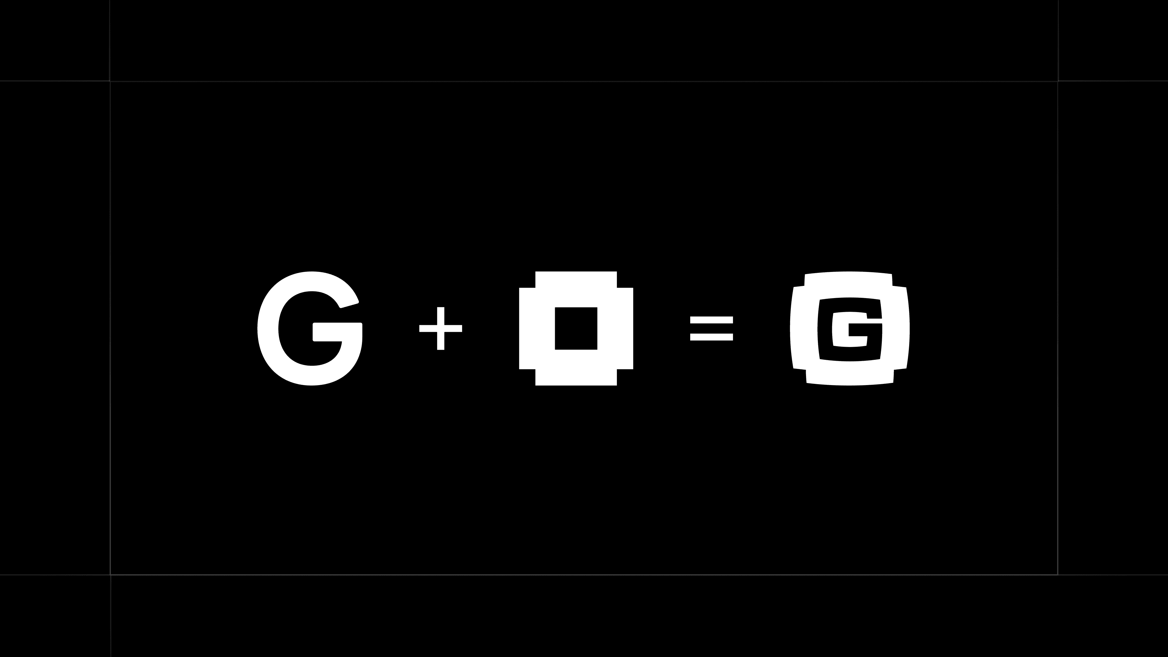
The first variation takes inspiration from the clean, sophisticated silhouettes of modern industrial design found in compute chips combined with the letter G (initial of GPU.NET) .
The first variation takes inspiration from the clean, sophisticated silhouettes of modern industrial design found in compute chips combined with the letter G (initial of GPU.NET) .
The Core of Computing
The first variation takes inspiration from the clean, sophisticated silhouettes of modern industrial design found in compute chips combined with the letter G (initial of GPU.NET) .
The Core of Computing
The first variation takes inspiration from the clean, sophisticated silhouettes of modern industrial design found in compute chips combined with the letter G (initial of GPU.NET) .
Symbol of Global Compute
Symbol of Global Compute
The second variation aims to represent a world inter connected with technology, grid and a vision to make compute accessible—a declaration to enable every vision across the globe.
The second variation aims to represent a world inter connected with technology, grid and a vision to make compute accessible—a declaration to enable every vision across the globe.
Symbol of Global Compute
The second variation aims to represent a world inter connected with technology, grid and a vision to make compute accessible—a declaration to enable every vision across the globe.
Symbol of Global Compute
The second variation aims to represent a world inter connected with technology, grid and a vision to make compute accessible—a declaration to enable every vision across the globe.
Driving Towards Success
Driving Towards Success
The third variation aims arrows symbolizes the power of community and collaboration through the repetition of these upward arrows and the pixels making up the figure.
The third variation aims arrows symbolizes the power of community and collaboration through the repetition of these upward arrows and the pixels making up the figure.
Driving Towards Success
The third variation aims arrows symbolizes the power of community and collaboration through the repetition of these upward arrows and the pixels making up the figure.
Driving Towards Success
The third variation aims arrows symbolizes the power of community and collaboration through the repetition of these upward arrows and the pixels making up the figure.
The Final Logo
The Final Logo
The Final Logo
The client requested us to explore further in the second direction as they wanted the logo to illustrate the planetary grid of compute aspect of the brand.
The client requested us to explore further in the second direction as they wanted the logo to illustrate the planetary grid of compute aspect of the brand.
The client requested us to explore further in the second direction as they wanted the logo to illustrate the planetary grid of compute aspect of the brand.
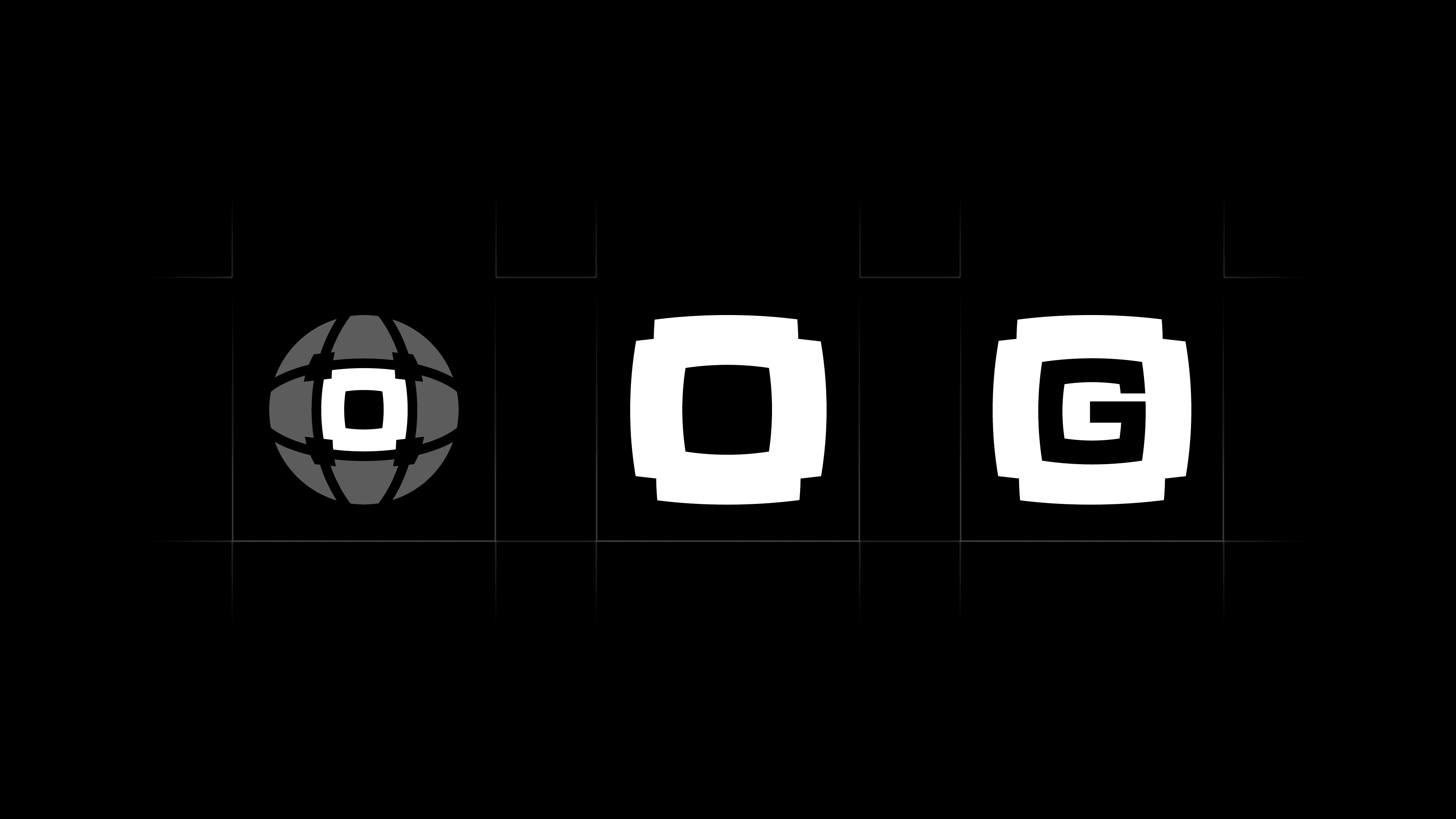
Borrowed from the concept of interplanatery grid of compute, the union of the globe and processor emphasizes GPUNET's commitment to making computational power available to everyone, everywhere.
Borrowed from the concept of interplanatery grid of compute, the union of the globe and processor emphasizes GPUNET's commitment to making computational power available to everyone, everywhere.
Borrowed from the concept of interplanatery grid of compute, the union of the globe and processor emphasizes GPUNET's commitment to making computational power available to everyone, everywhere.
3.2 Logo Animations
3.2 Logo Animations
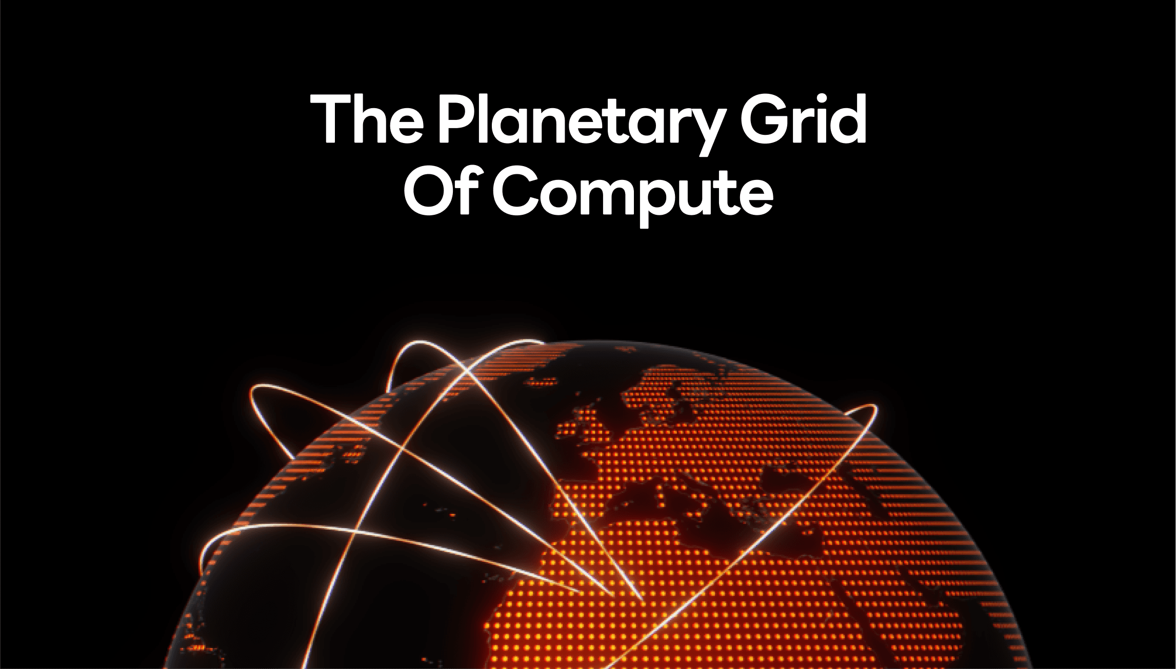
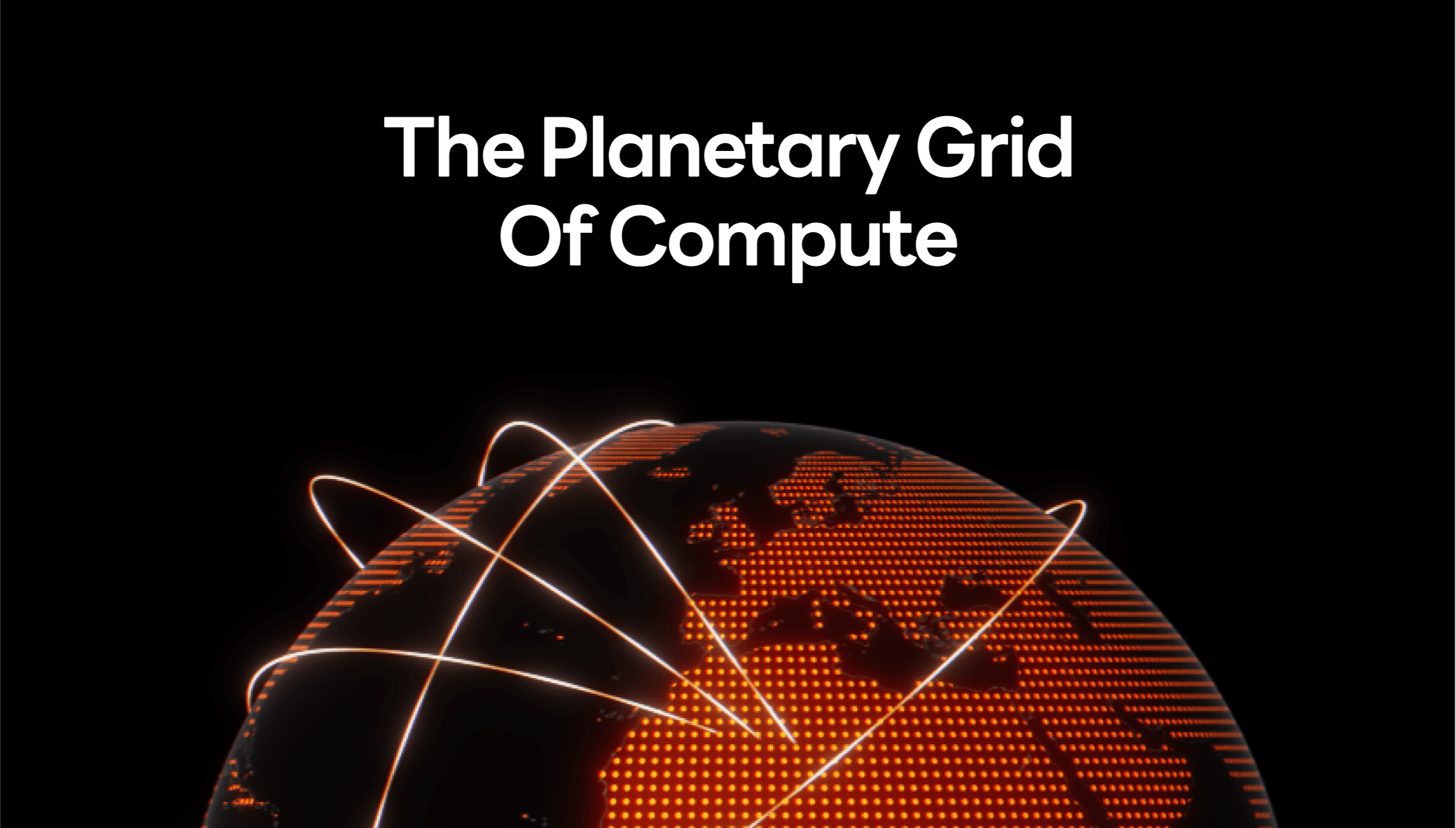
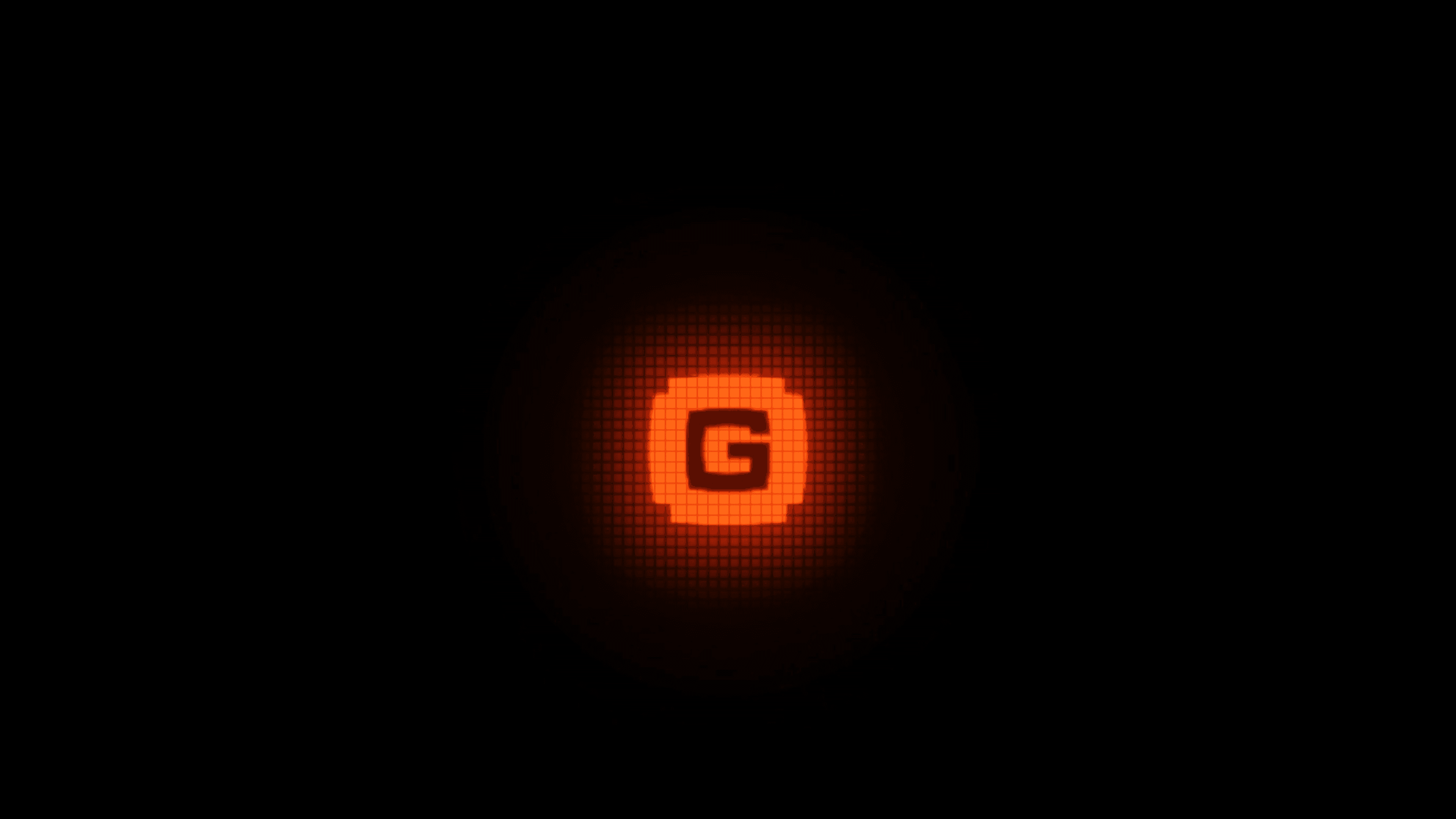
To further enhance the style and narrative, I developed two distinct animations for the GPU.NET logo, both incorporating a retro-CRT aesthetic.
To further enhance the style and narrative, I developed two distinct animations for the GPU.NET logo, both incorporating a retro-CRT aesthetic.
Emphasizing the brand’s core focus on computing power, visually representing the processing strength that GPU.NET offers.
Emphasizing the brand’s core focus on computing power, visually representing the processing strength that GPU.NET offers.
Highlighting global accessibility, illustrating how GPU.NET connects users across the world to high-performance computing resources.
Highlighting global accessibility, illustrating how GPU.NET connects users across the world to high-performance computing resources.
3.3 Brand Deck
3.3 Brand Deck
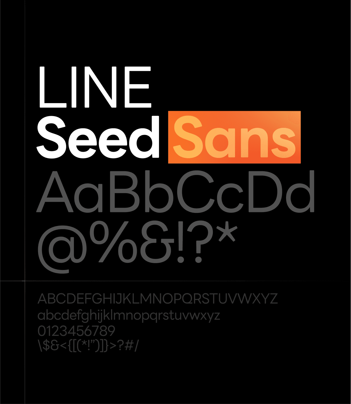
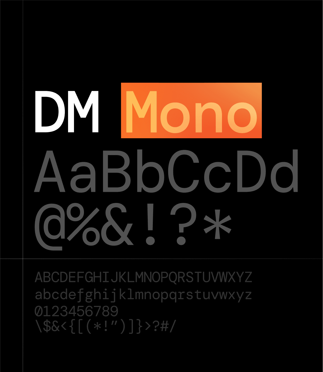
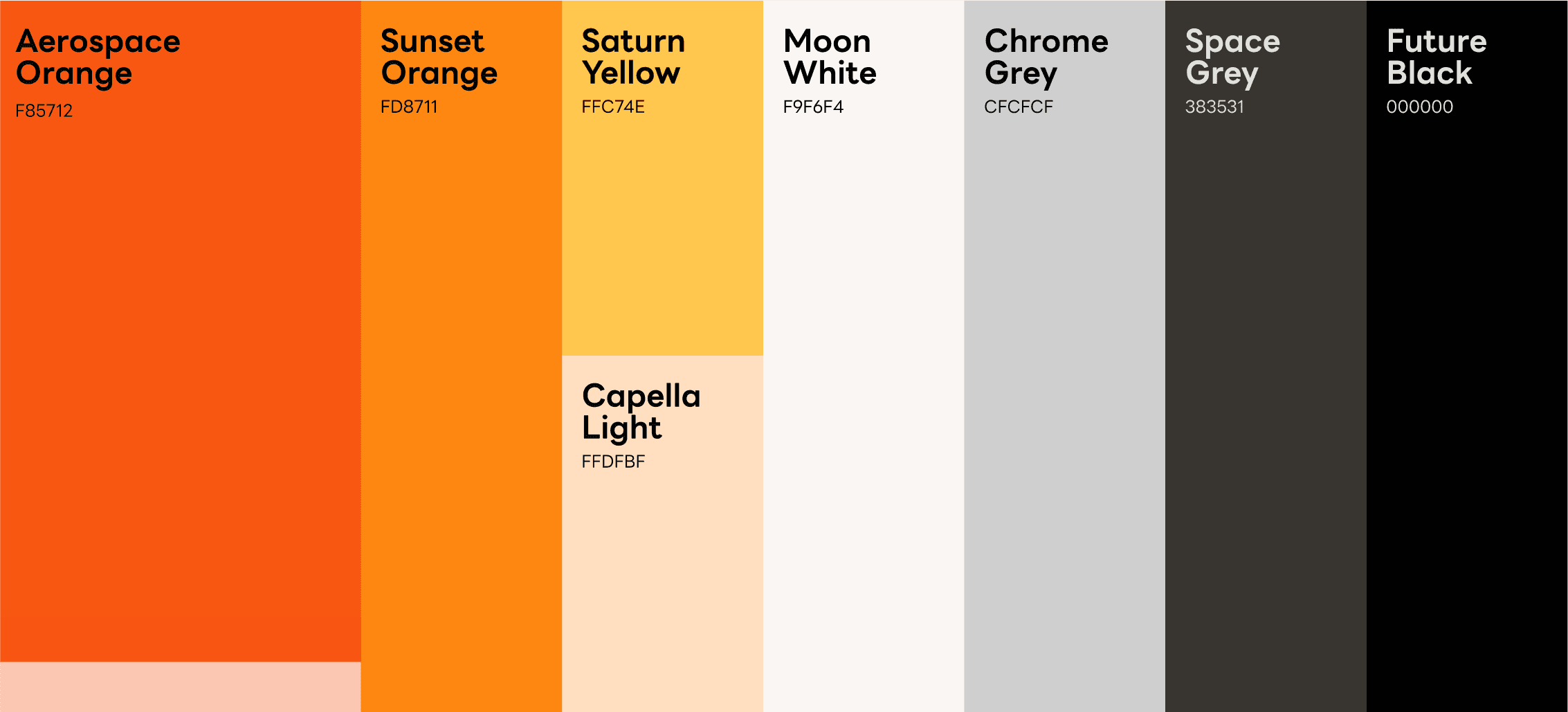
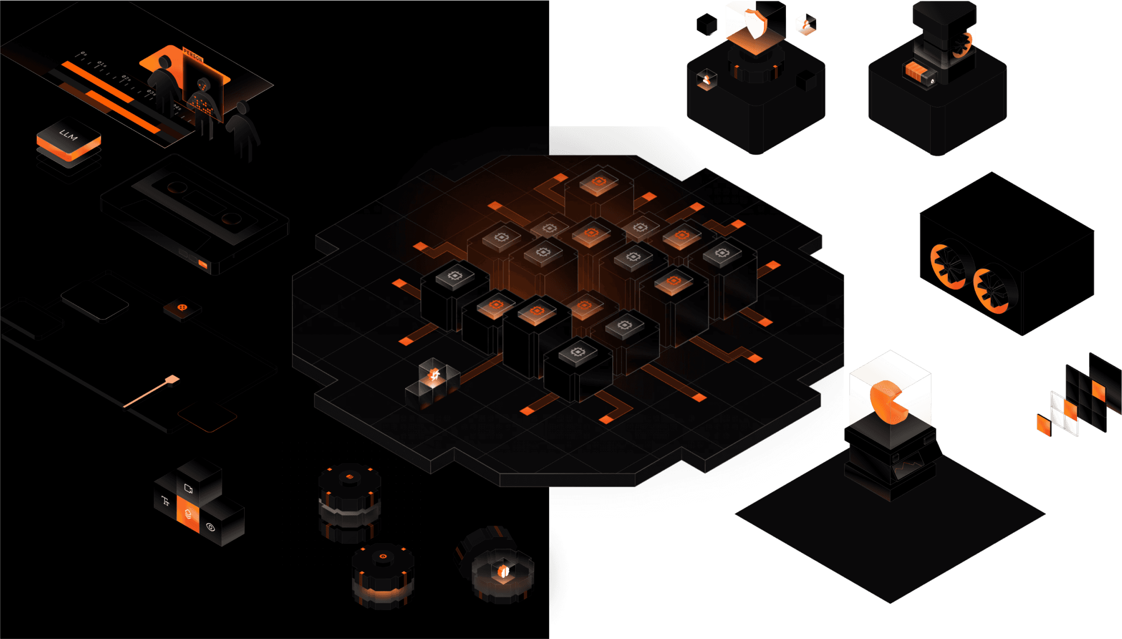
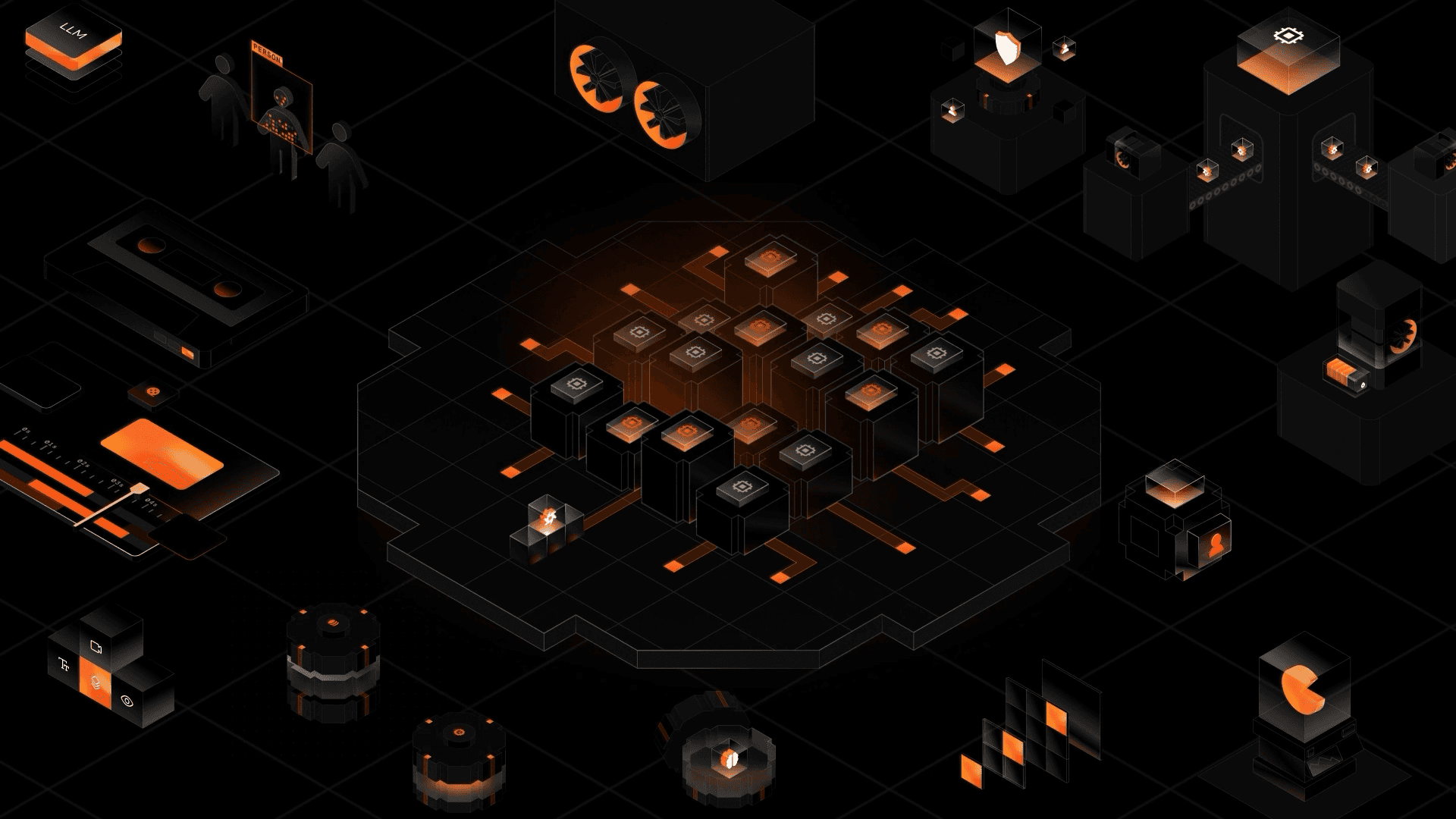
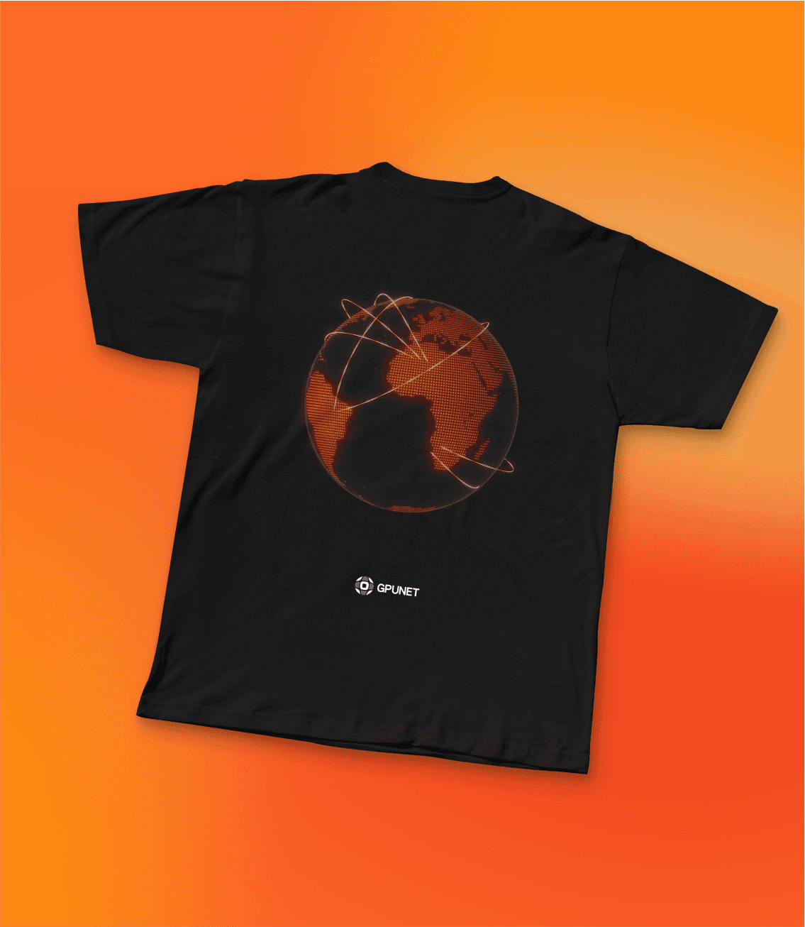
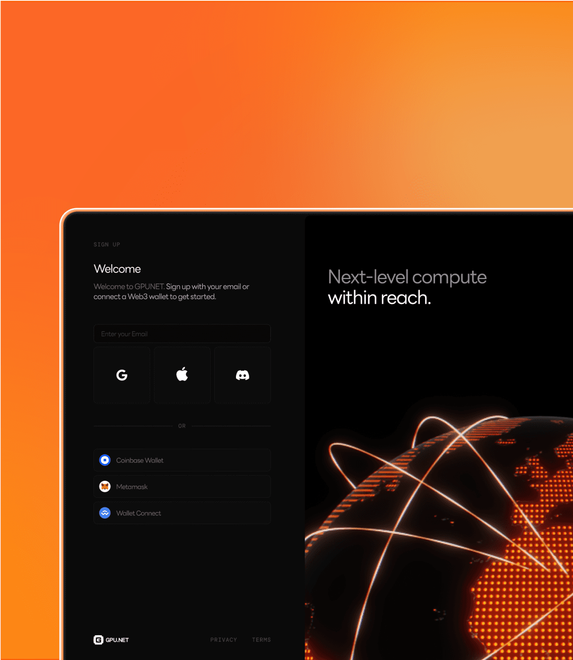
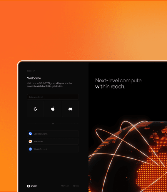
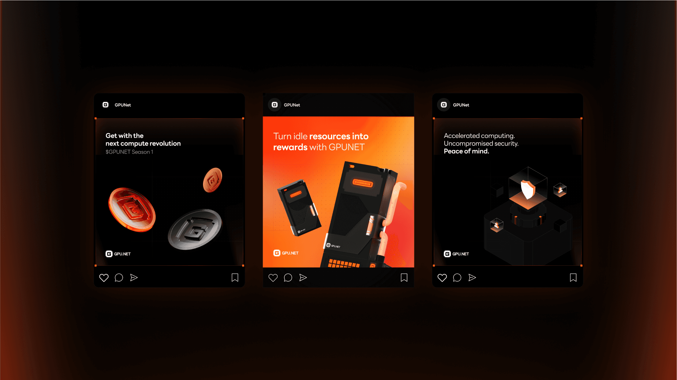
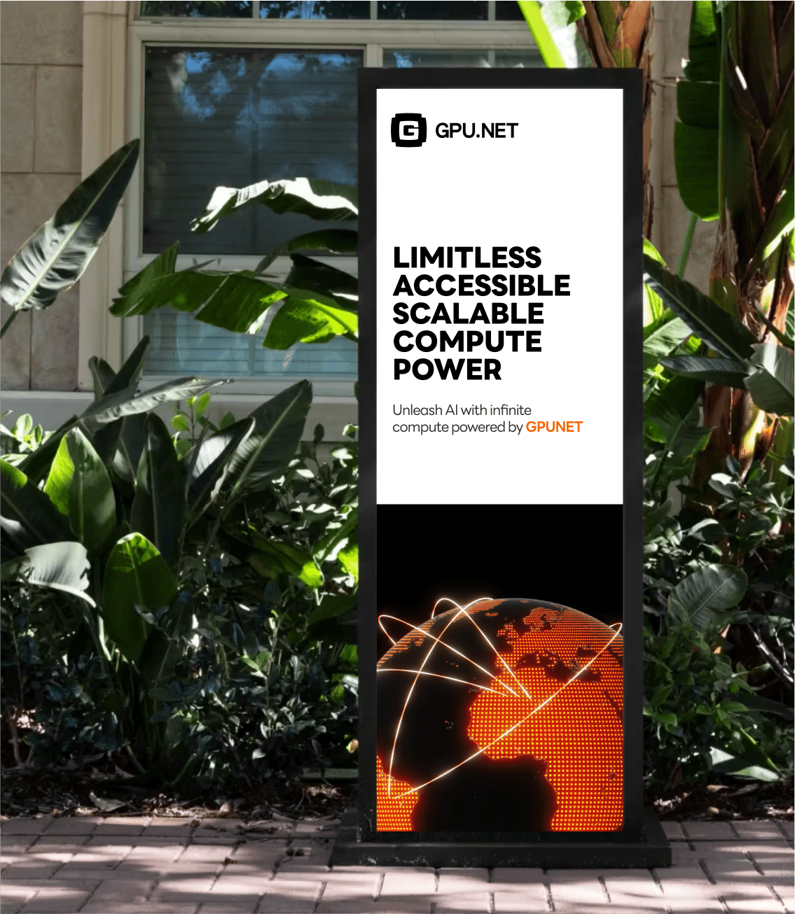
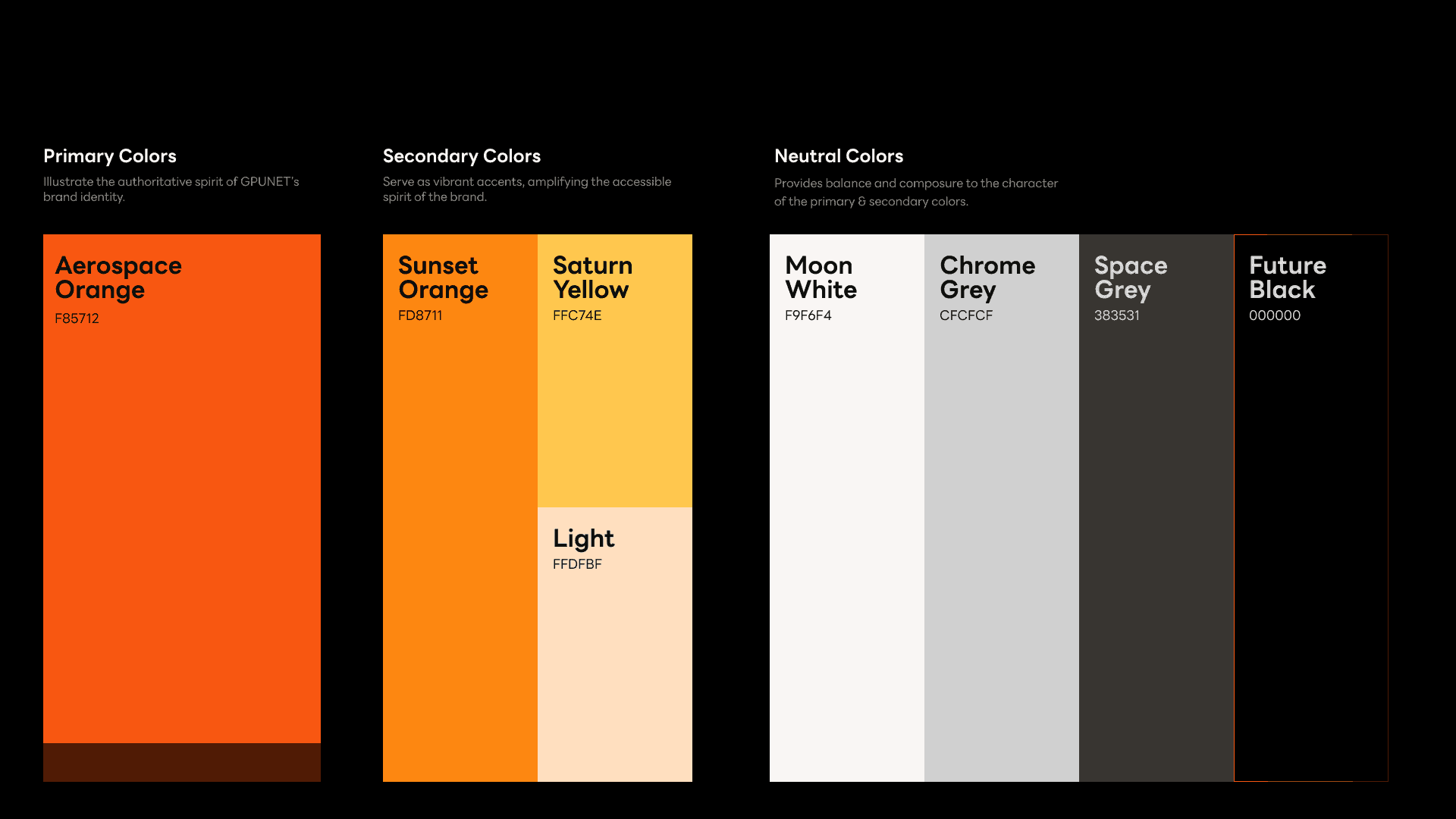
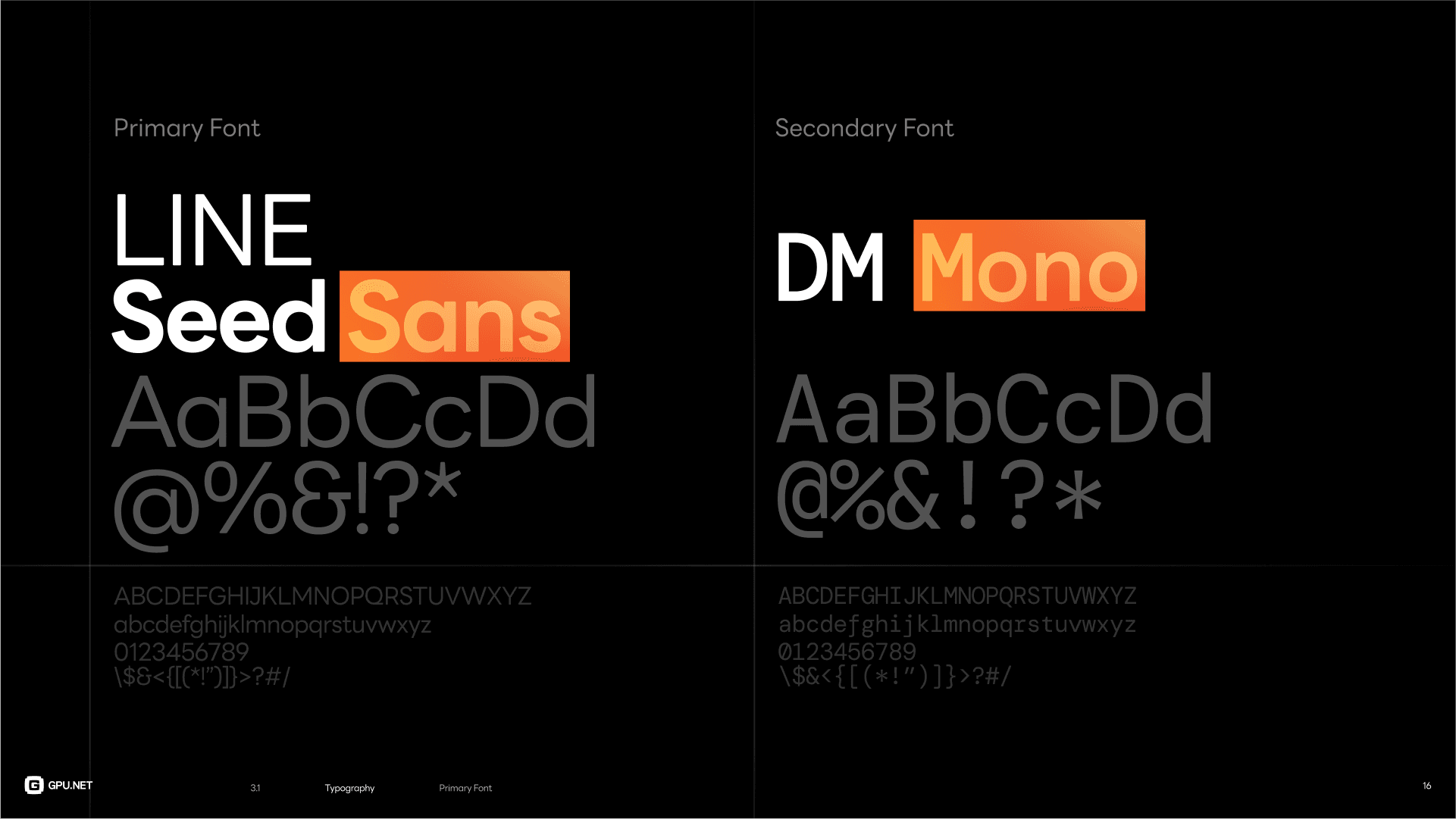
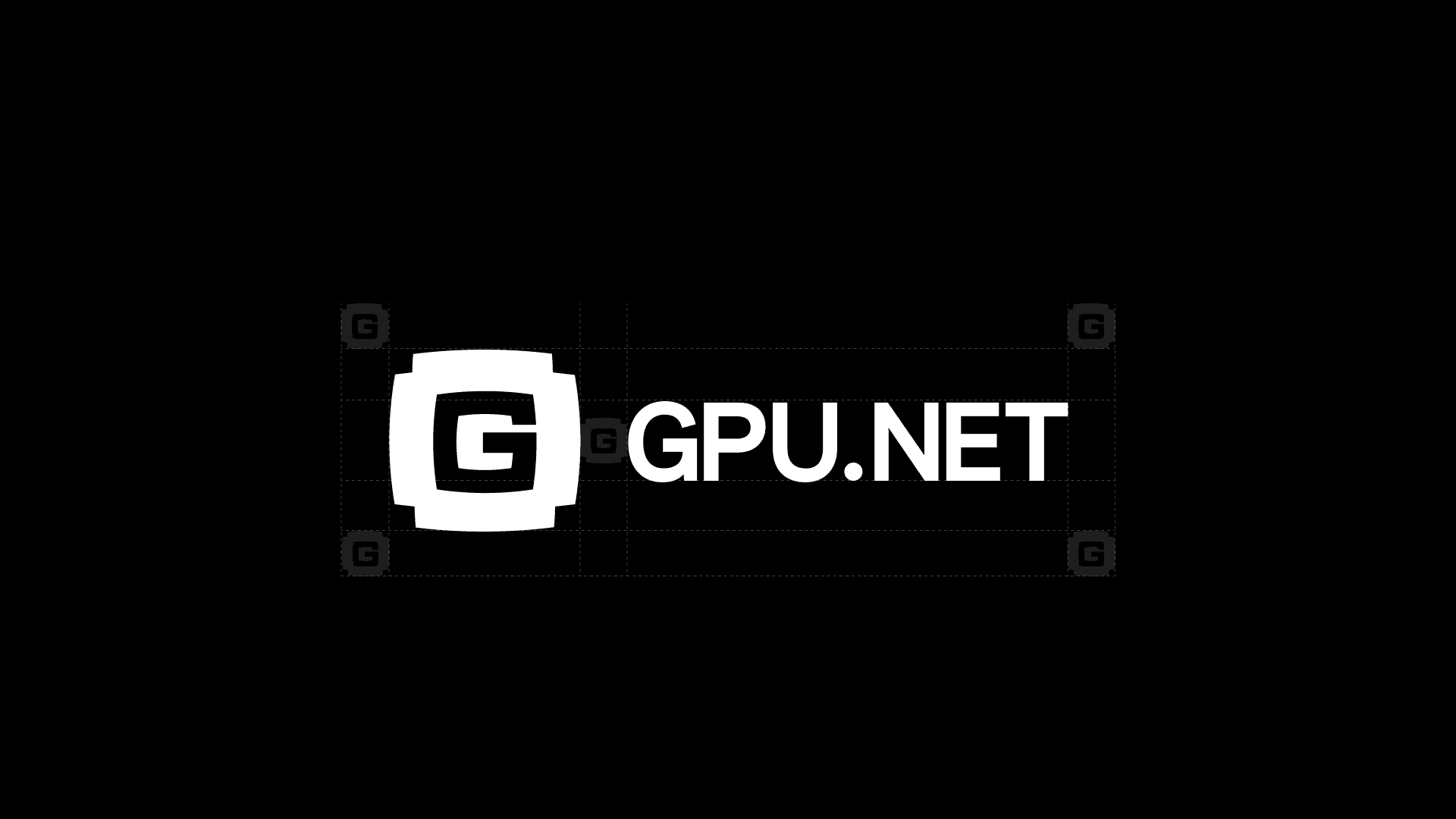
The brand deck encapsulated the final brand identity, serving as a comprehensive guide for future usage. It included the final logo, selected typography, color palette, visual elements, motion elements and mockups to show how the brand would appear across different touchpoints.
The brand deck encapsulated the final brand identity, serving as a comprehensive guide for future usage. It included the final logo, selected typography, color palette, visual elements, motion elements and mockups to show how the brand would appear across different touchpoints.




















3.2 Motion Illo
3.2 Motion Illo
I created animations for the logo to showcase the narrative behind it.
Showcasing
Showcasing
the final brand in motion
the final brand in motion
the final brand in motion
-the final stage of the process was to showcase everything in motion. A co-marketing video for both GPU.NET and Spacekayak was made to promote the brand refresh on social media platforms.
-
-the final stage of the process was to showcase everything in motion. A co-marketing video for both GPU.NET and Spacekayak was made to promote the brand refresh on social media platforms.
-the final stage of the process was to showcase everything in motion. A co-marketing video for both GPU.NET and Spacekayak was made to promote the brand refresh on social media platforms.
4.1 Storyboard
4.1 Storyboard
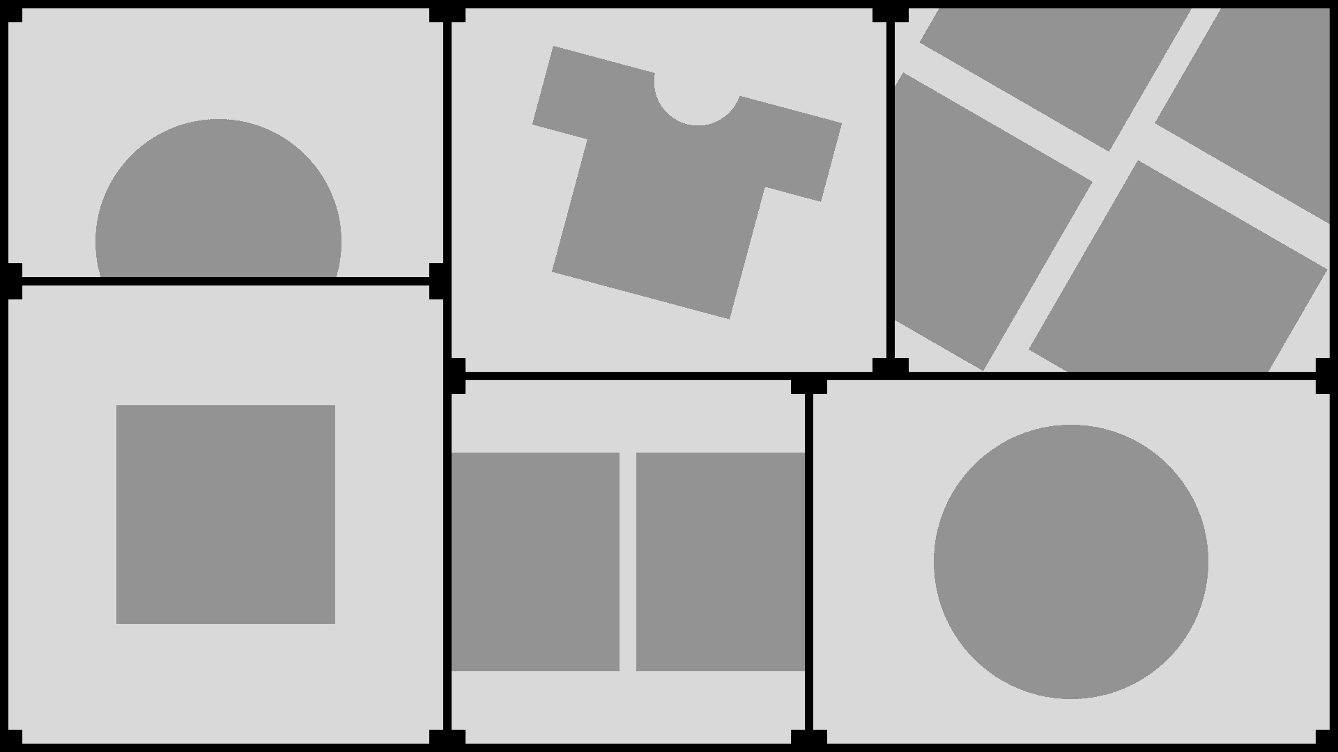
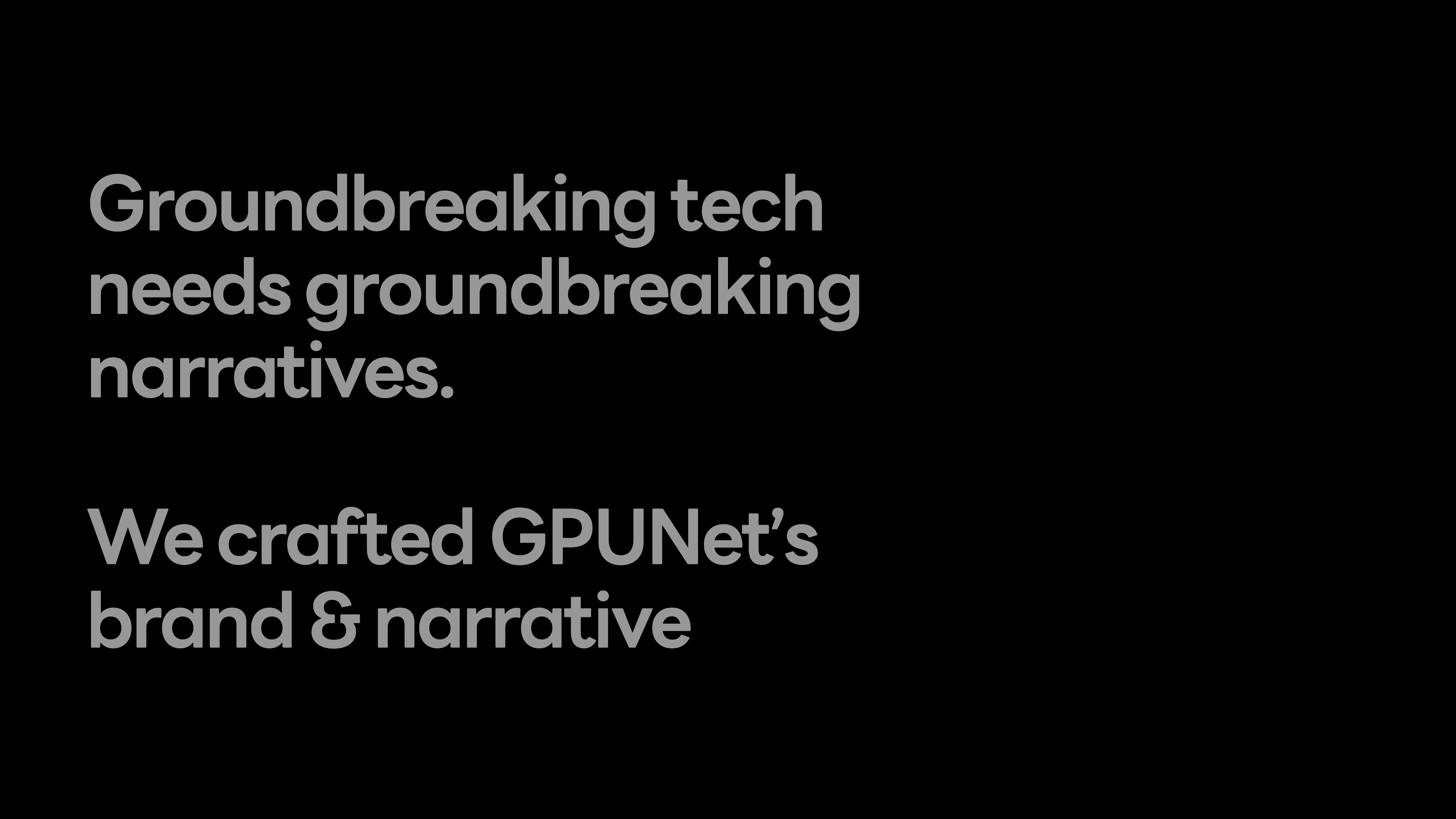
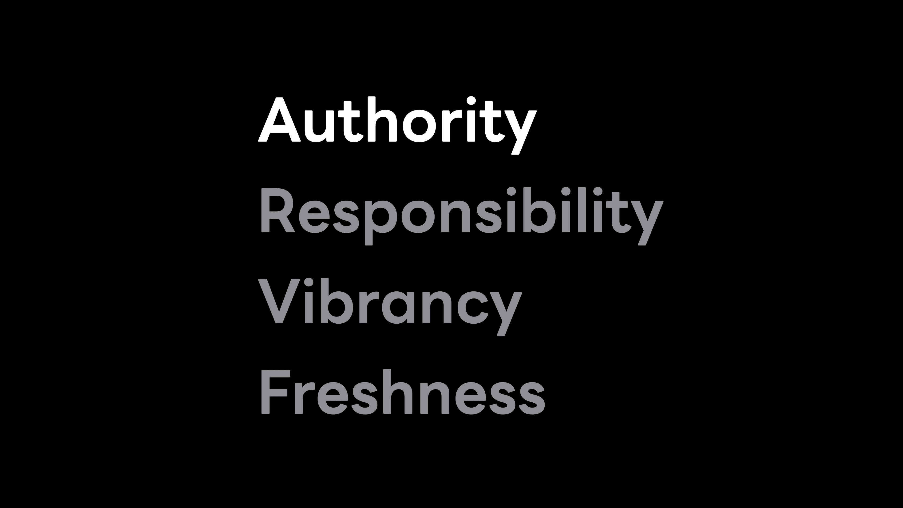
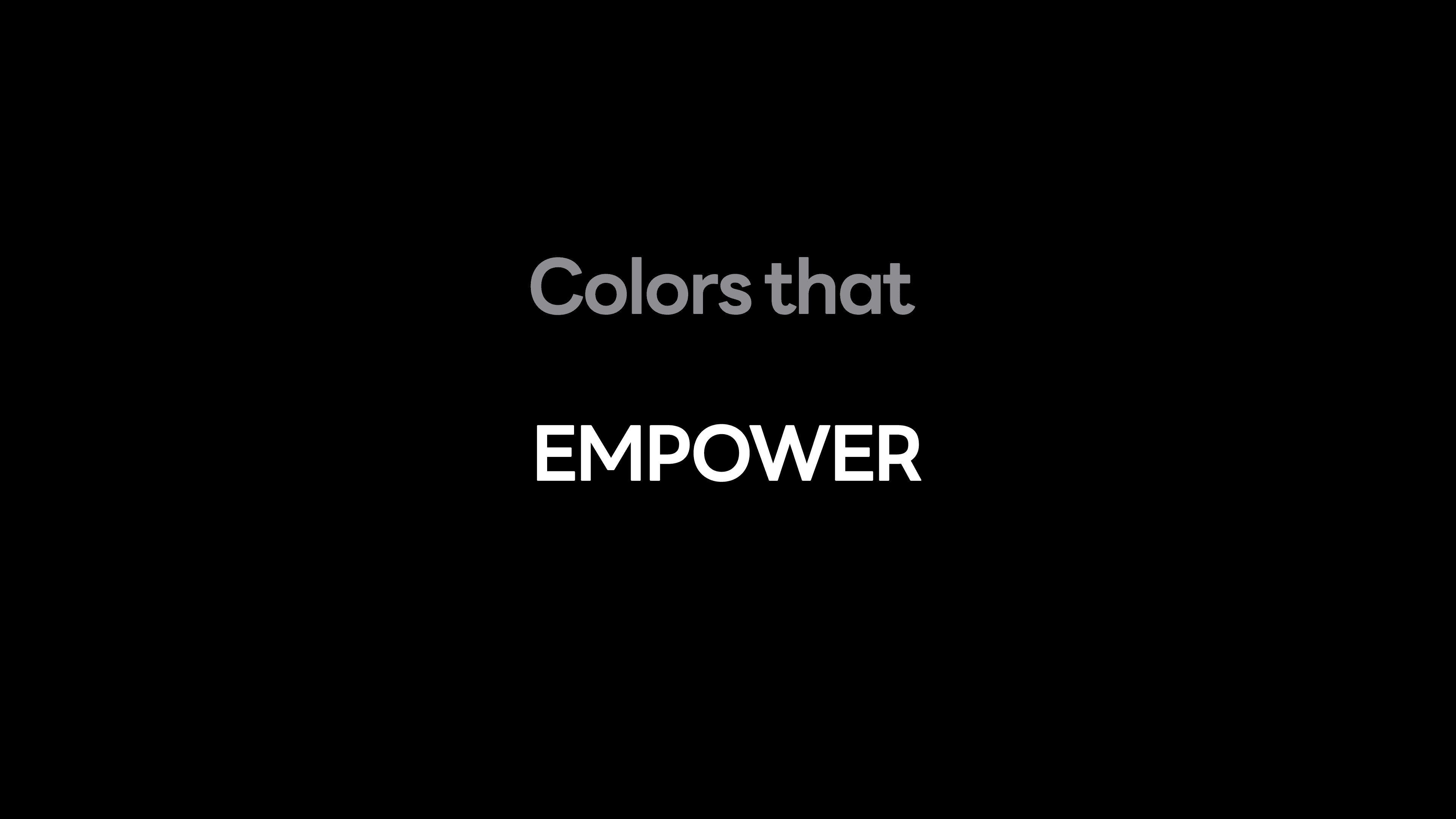
I created storyboards for the whole video, planning out the different scenes along with the transitions between them. I ideated different ways to show the brand and its elements to make them stand out.
I created storyboards for the whole video, planning out the different scenes along with the transitions between them. I ideated different ways to show the brand and its elements to make them stand out.

















































4.2 Styleframes
4.2 Styleframes
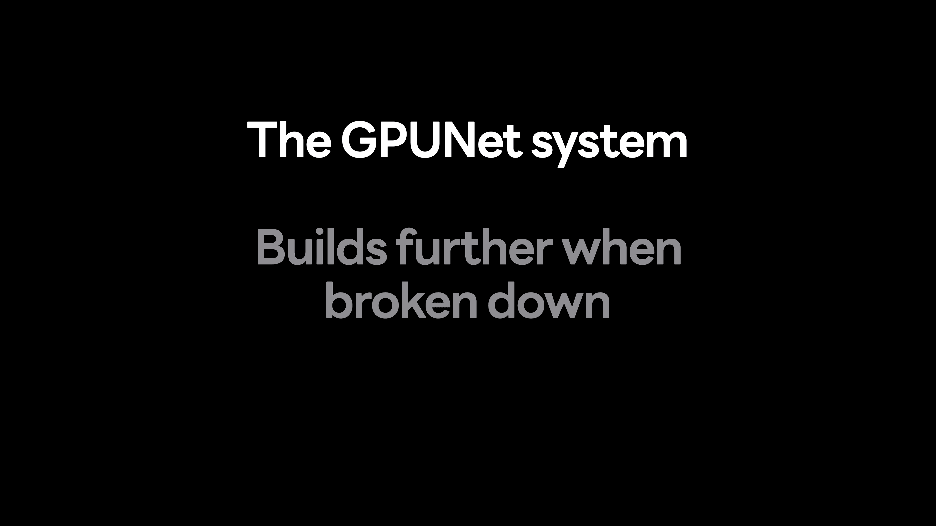
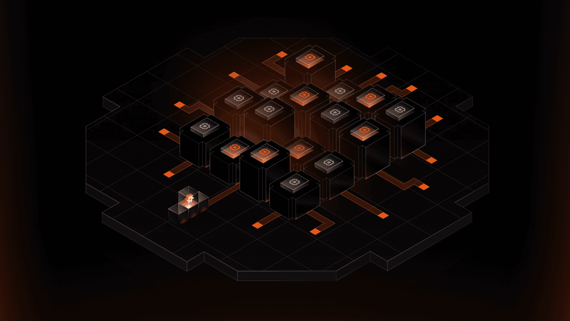
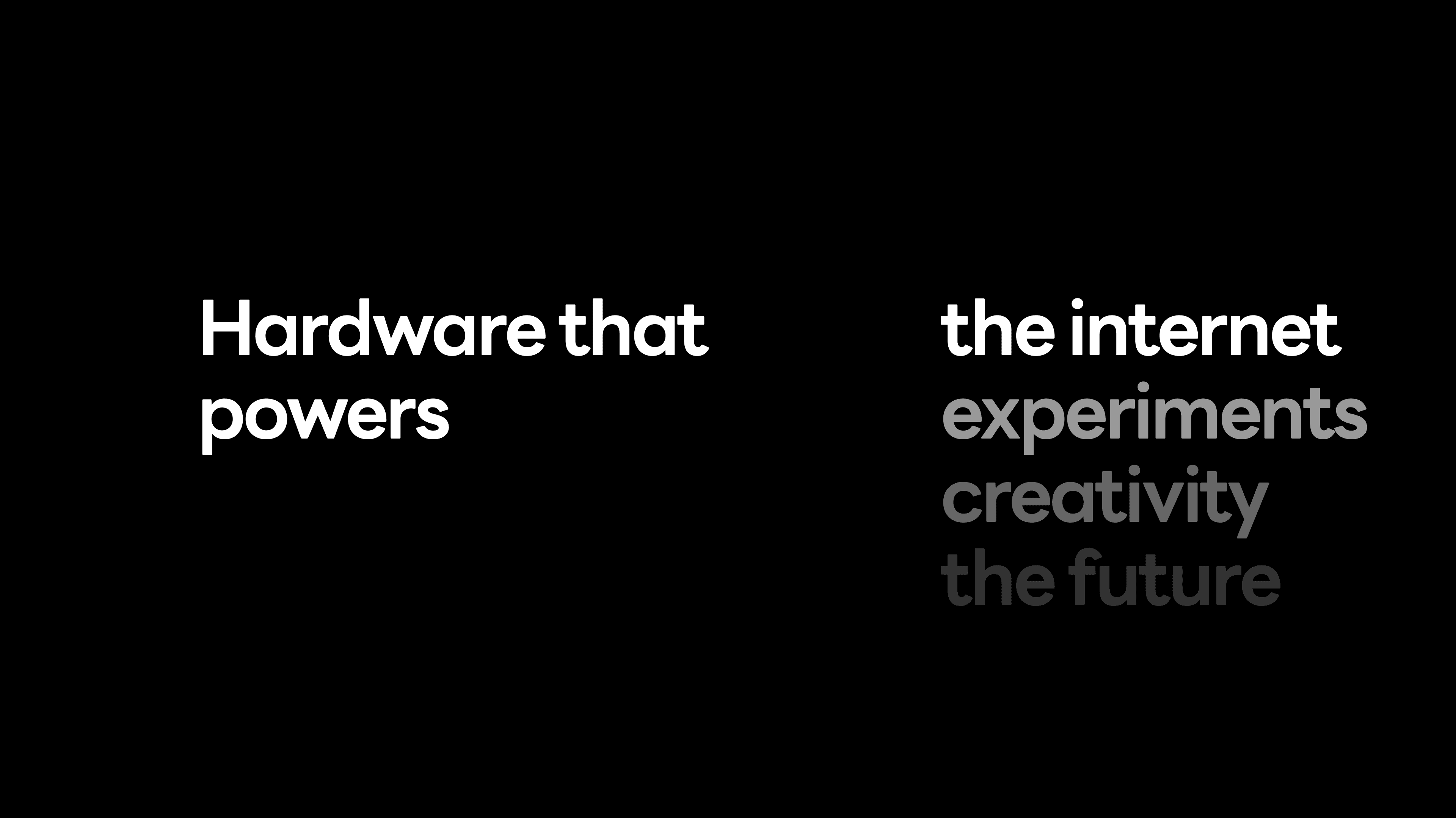
Before diving into animation, I created styleframes to show how the final video would look, incorporating the newly developed brand elements to finalize how each scene would look along with preparing frames for animation.
Before diving into animation, I created styleframes to show how the final video would look, incorporating the newly developed brand elements to finalize how each scene would look along with preparing frames for animation.
4.3 Final Scenes
4.3 Final Scenes